12 April 2012 · Benedikte Vanderweeën
The design process of the Startups.be logo
The brief
Short description
IBBT asked me to make the logo for this initiative. As I had limit time to design this logo, i had some ideas already in my head how i should start this design process. The brief was short, the logo didn't have to contain any symbols. I had much freedom in doing this logo so i started with a few ideas i had in my mind. Because of the fact that the font use of the logo would be important.
The initial drawing process
Sketches and drawings
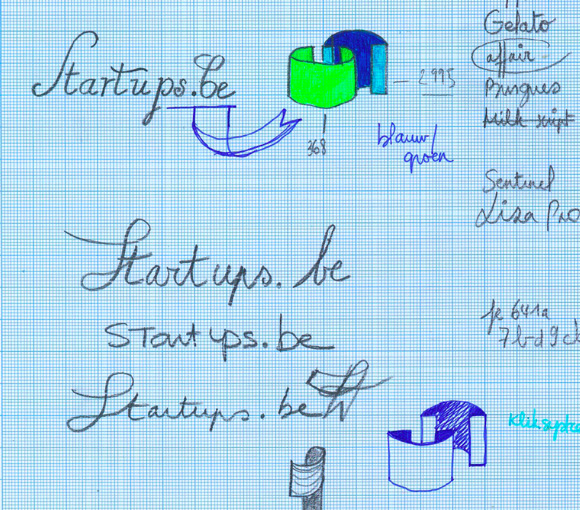
I started by opening Illustrator and typing the word Startups. The next step is scrolling through the font list until the moment i see the word in a type i like. But what i had in mind results mostly in disappointing proposals. I had a "handwritten" font in my mind, but it's hard to find a font that reflects that exactly so i decided to adjust the letters of the written logo myself until i got a satisfying result.
The font choice
A lot of fonts
The list of wonderful fonts i had in mind were:
- Gelato Script by Schizotype
- Affair by Sudtipos studio
- Burgues Script by Sudtipos studio
- Milk Script by Sudtipos
- Sentinel by Hoefler & Frere-Jones
- Liza Pro by Underware
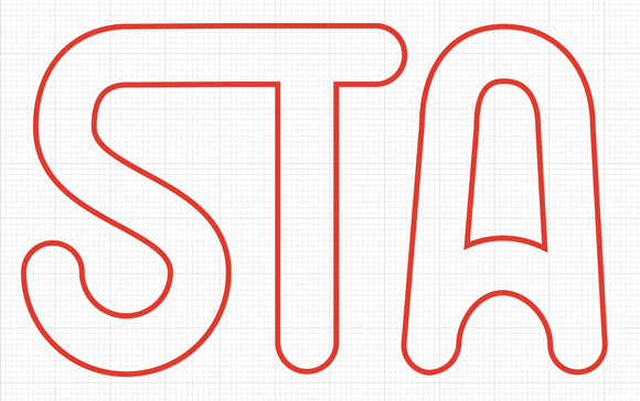
But i didn't use these awesome script fonts mainly because they didn't accord to what i had in mind. I started with the pen tool drawing and began with the S and T contours and further on. This resulted in these sketches:
The colors
Choosing the right palet
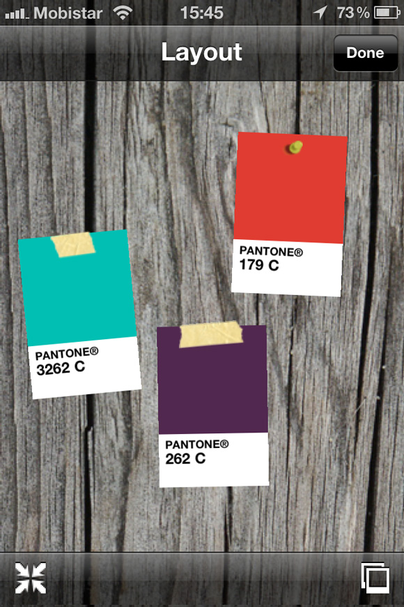
I had some different color combinations in mind with this logo, it's a bit ironic that the end logo just contains 1 color as i had a wild bunch of colors in mind. Like combinations of red with light blue and purple, i made some test Pantone swatches of color combinations:
The proposals
I presented these 5 proposals
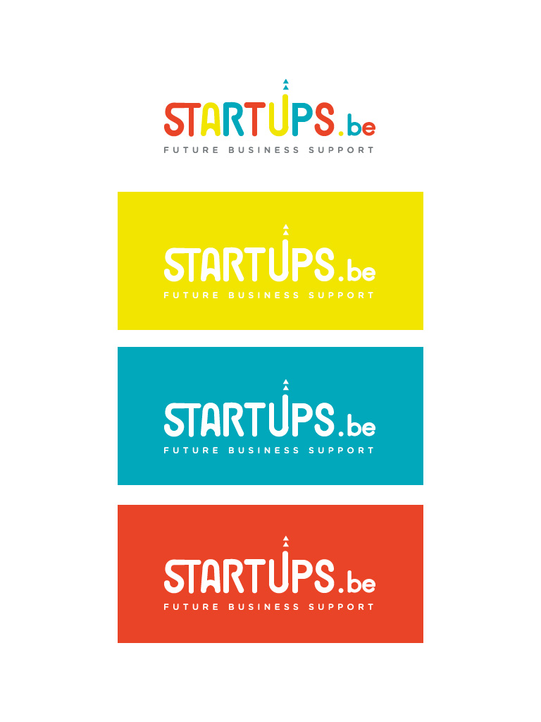
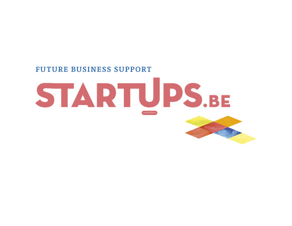
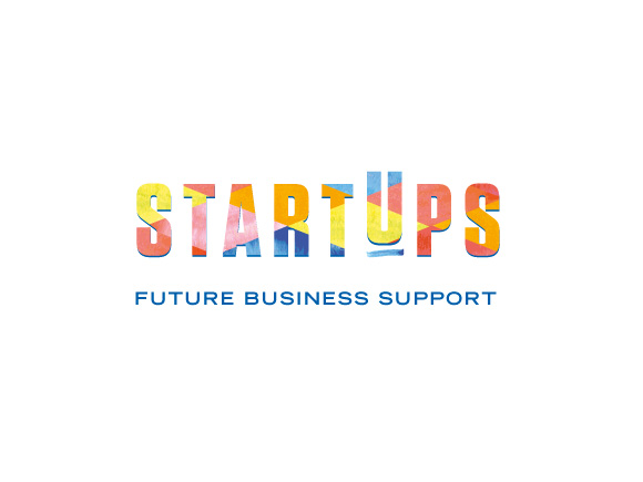

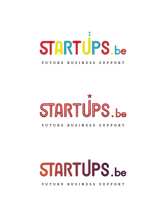
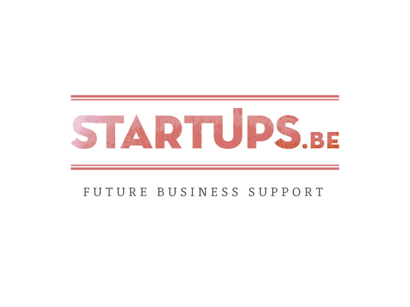
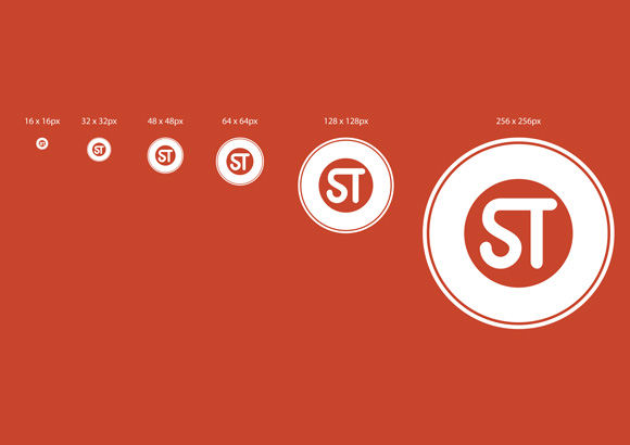
The feedback i got had mostly to do with readability issues: the logo should also be legible at very small size and presentable in black and white, so i did some more adjustments on the logo's and the final one resulted in using just 1 color. I also presented 3 different badges for use as avatars and icons in social media sites at different sizes (256 x 256px, 128 x 128px, 64 x 64px, 48 x 48px, 32 x 32px, 16 x 16px).
Read more (in Dutch): Datanews article by Frederik Tibau