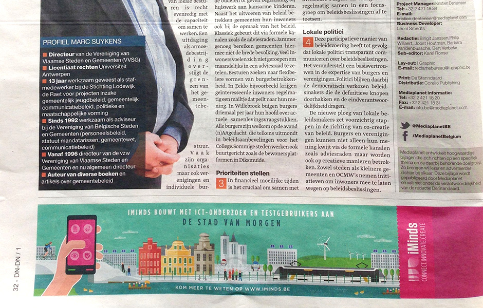
The brief
Few weeks ago, I was asked to make an illustration for iMinds. The illustration was meant to be published for the paper and has the dimensions of a banner. I started from the given title "Stad van de toekomst" - (City of the future) to set the atmosphere for the illustration. The city had to be no city in particular but had to function more as a concept of what a 'smart city' can look like in the near future.
I started by writing down words and tags and searched for images to give me a complete image of the subject: smart city, sustainability, city life, eco-friendly energy, people, applications, challenges, city atmosphere, bikers, mobility, waste disposal, public space, smart meters, smart grids, RFID tags, healthcare providers, street security cameras, public transportation, facilities, …
Challenge for Smart Cities is people: is a city as smart as its citizens?
Historic cities
Most of our belgian cities have a big cultural heritage, think of the big cathedrals, belfries, monuments, small streets, small canals, medieval paintings, museums, old houses, …
I thought of the painting of the "Flemish Primitives" and "the Ghent Altarpiece" - well known all over the world for the excellent craftsmanship in painting in 15th and early 16th Century. These paintings remain constant inspiration and give a very detailed way of the visible world in that time.
Initial sketches
With all these terms and inspiration in mind, i looked for a way to connect the "future city scape" idea with the historical part of most of our belgian cities (like Bruges, Ghent, Tournai, Mechelen, Brussels … ).
My idea was to draw a city scene like you would see while taking a snapshot with your smartphone on a beautiful day walking through the city.
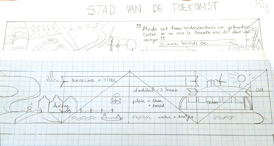
I set up a layout in Illustrator - i divided the banner in an upper and lower part and made diagonals from the middle to the outer parts. I decided to give the grid subdivisions of half a centimeter.

Mood boards and drawing the elements
I started drawing the elements in Illustrator on a few Artboards to give myself some impressions of how i could make a composition. By drawing and coloring the elements, i started to make a composition with some elements, adding and subtracting some elements until i had the composition i wanted.
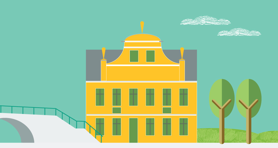
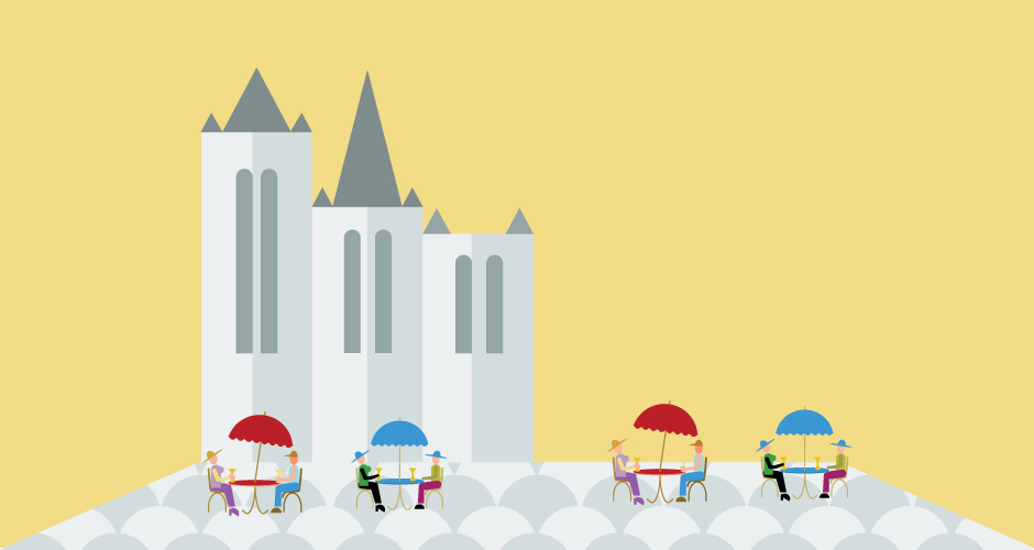
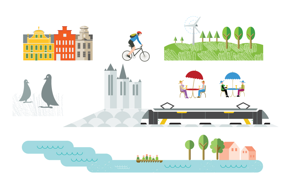

I started drawing the elements in Illustrator on a few Artboards to give myself some impressions of how i could make a composition. I decided to draw vectors of all elements, in case the dimensions for the illustration would change and because i wanted the elements to be sharp looking.
Colors and font use
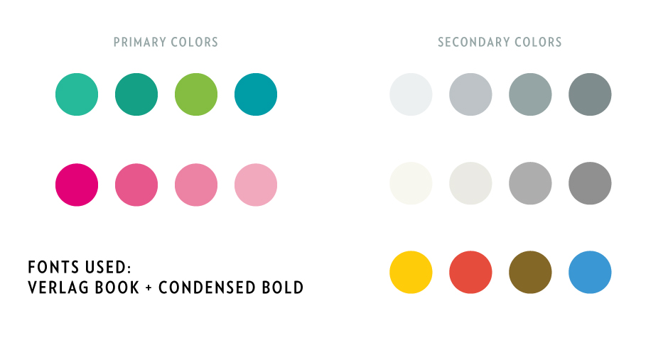
One of the Illustrator Artboards i made was for font use and color. I tried many palettes but finally found this one to be the right one:
Versions


Final printed, paper result
