Sep 14
Making a style guide
Posted by Benedikte Vanderweeën on 14/09/2009
The previous months and weeks, I’ve been busy with some projects for both web and print. The print projects have my full attention at the moment and so I wanted to share some of the things I’m making for a client. Because I cannot share the name of the client, i have replaced the logo with my own, hope you don’t mind. I’m going to show how I did the style guide for this project. A style guide can be a really helpful guide. For me, it is an anchor point to refer to when I’m busy designing for the same client. It helps me focus on the colors, the style, the elements that are important when building an identity for print and web. I designed this style guide with Adobe InDesign.
Content of the styleguide
The content of the style guide
The content part of the style guide is the part where you explain what you give your client. For your client it is important to find the elements that he will need once the identity is finished. Questions as: what are the printing colors of the logo when he is at the print supplier. Things like : what font-size do I use in relation to other elements, what font-family do I use in print? and what font-family do I use when I make a website, this style guide should give your client an answer.
Logo: PMS color and CMYK
Start by giving the logo PMS (Pantone matching system) colors. It is an accurate way to share the color values and to be sure, the logo colors will display and print correctly. Convert the Pantone color into CMYK values for print (digital print)

Logo: greyscale and black
Make sure you convert your logo into greyscale and black. Add the correct greyscale values for consistent display around media.

Logo: space around the logo
An important guideline is to give the right proportions of space around the logo. In this case, I use the letter "b" as the spacer element around the logo element. If there is a baseline in the logo, you'll have to indicate the space between the logo and the baseline. Here, the space between the first line of the logo (bene.be) and the baseline is the height of the baseline.
Also, give a minimal width or height to display your logo to avoid that your logo or baseline is unreadable.

Logo: how NOT to display the logo
Avoiding unpleasant surprises on how your logo is displayed, this you can do by giving indications on how NOT to display your logo with real life examples.
Give CLEAR instructions on how NOT to use the logo, if you hate drop shadows or other effects, mention them, readers of this guide will understand what to do with your logo.

Logo: how to display the logo CORRECTLY
Insert a page where you explain how to use the logo correctly. In case of colored backgrounds, black backgrounds or on photographs, give clear instructions how the logo should appear.

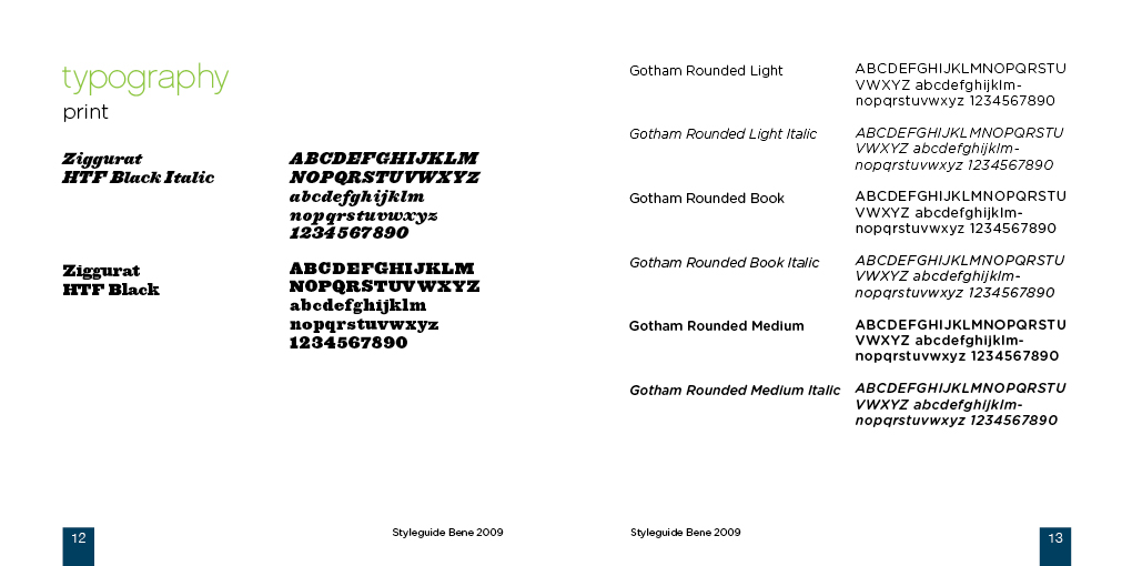
Typography
Specify the font you used for the logo and the fonts that should be used for print purpose, you can always specify a second font that can be used for the body text in print. Include a specification for web use. Specify the font that should be used in web documents, the more you specify the styles that should be used, the more you can be sure, the identity will appear correctly. Give a specification for the body text, for the headings. Give the size proportions between the heading and the baseline in your logo. Here in this case the font proportions are 80% and baseline 40% of the heading.
Make a distinction between a Mac and a PC if the fonts are not available on both platforms, an alternative font should be specified.
Use this website for font use on the web: Typechart

Photographs and other elements
If you have instructions on how and what kind of photo's to use with the identity, specify this further in the guide. The same goes for icons, if you use icons that are important and/or related to your identity, specify them in the guide and give a brief description on how to use them.


Connect