13 March 2009 · Benedikte Vanderweeën
Designing a website with a fluid, large background
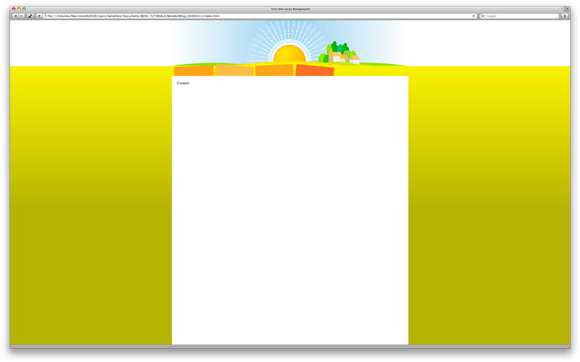
The final template viewed in Safari
Making the mock-up in Photoshop
I made a new document with dimensions of 1024 x 768 pixels. I opened my illustration and pasted it in the new document. Set your guides at the edges of the illustration so you know where the illustration starts en ends. I didn't want to crop the illustration but a fluid transition of the picture with the background color of the html page
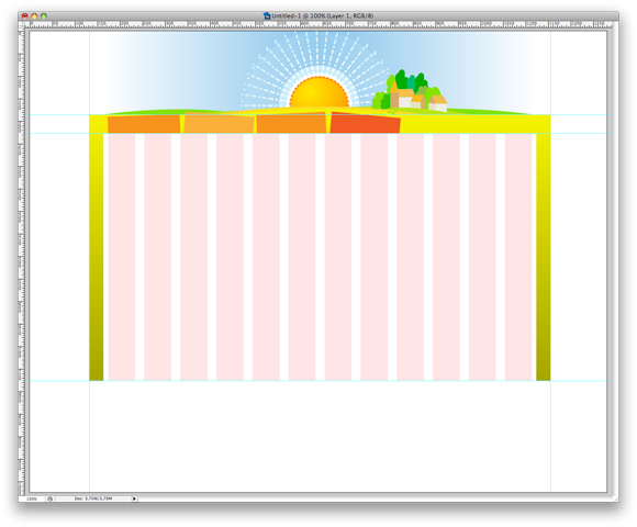
Divide your mock-up and crop separate images
Once you managed to integrate your illustration, you can start dividing your design in separate images.
In this case, we need to have the header background, the menu background and a background gradient for the overal page. I exported those 3 images as jpg's.
Start coding the xhtml and css
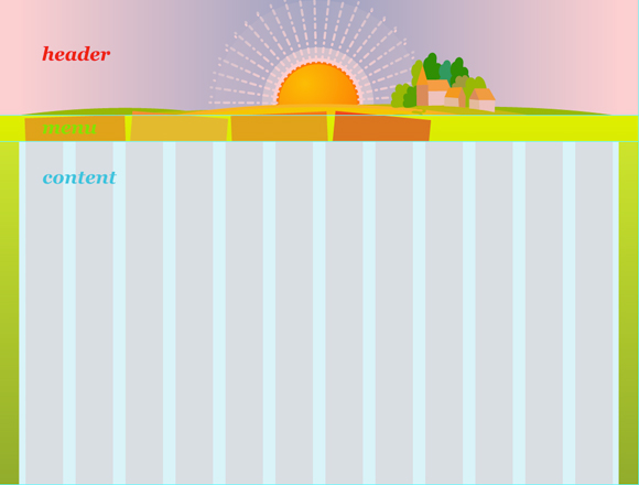
Make a new page with the normal mark-up: a html-tag, a head-tag and a body-tag. Within the body-tag, make 3 different div-sections: a header div, a menu div and a content div
<html>

<head><title></title></head>


<body>

<div id="header"></div>


<div id="menu"></div>


<div id="content">Content</div>


</body>

</html>
In this example, I will put the CSS for the page in the head section, normally the CSS is put in an external file and linked to in the head section.
<style>

html{

margin: 0;

background: #a5a600 url(bg_body.jpg) repeat-x;

}


body{

margin:0 auto;

width:960px;

padding:0;

background:#fff url(boven-bg.jpg)no-repeat center top;

}


#header{

height:185px;

}


#menu{

background:url(menu_bg.jpg)no-repeat center top;

height:42px;

}


#content{


margin:0;

padding:20px;

height:550px;

}

</style>
Test your result in different browser
Before you start the actual content, make sure your template shows up correctly in the different browsers. This template was tested in Safari, Opera and FireFox.
Download the template
You can download the template with the images: Zip Archive