11 December 2008 · Benedikte Vanderweeën
Choosing harmony colors from a logo
Choosing the client's logo
The logo here has a red Pantone value of 186 solid coated. The next step is to choose this spot color from the color library in Illustrator.
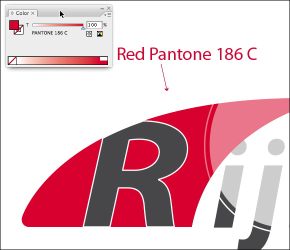
Choose your logo color from a color book inside Illustrator
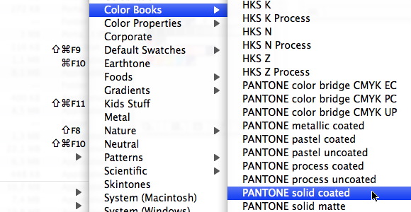
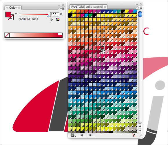
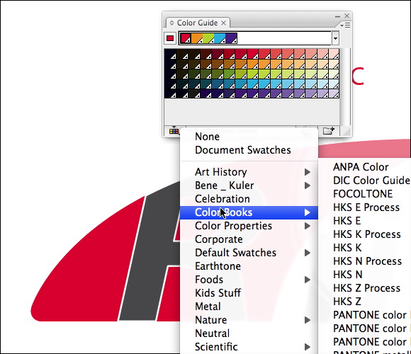
Open your logo file and look up the color inside a color book by selecting Window > Swatch Libraries > Color Books > Pantone Solid Coated. You can also click the bottom left of the panel and choosing Color Books > Pantone Solid Coated. Look for the exact value of your color. Click the color so that it stay selected.
Looking for color harmony
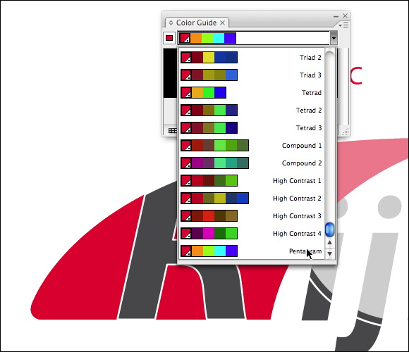
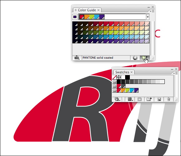
now that we have the first color, we open the Color Guide panel by choosing Window > Color Guide choose the Pentagram option to pick five colors that are evenly spaced around the color wheel. You can use the closest PMS color equivalents by pressing "Limit to Swatch Library" button at the bottom of the Color Guide and choose the Color Book > Pantone Solid Coated (or another Color Book).
Save your colors
You can save these 5 colors to the Swatches Palet as a Color Group by pressing the Save Color Group button at the bottom of the Color Guide Window. If you want these color values in Indesign or Photoshop, you can save these colors by selecting "Save Swatch Library as ASE" and then in the other applications, you can select the Load Swatches under the options menu of the Swatches Panel
Ready? Now we can start designing or presenting the color palette to the client. You can work with percentages of the colors. The percentages used in the Color Guide are 12,5%, 25%, 37,5%, 50% and so up to 100%
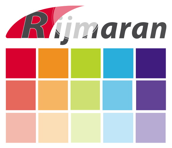
This feature in Illustrator has come in very handy for me. It's a big time saver. I'm planning to make such a color sheet for every client's logo.